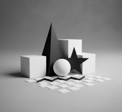
I used to think contrast was just about making things different from each other.
Then I spent an afternoon in the Musée d’Orsay staring at a Degas painting—one of those ballet scenes where the dancers seem to float against these impossibly dark backgrounds—and I realized I’d been thinking about it all wrong. Contrast isn’t just a technical trick designers use to make elements “pop” (though yes, that’s part of it). It’s actually the fundamental language our visual system uses to make sense of anything at all. Without contrast, you don’t have perception. You don’t have meaning. You don’t even have edges, really, because edges are just places where one thing ends and another begins, and how would you know that without some kind of difference to mark the boundary? The human eye can distinguish something like 10 million different colors, give or take, but what it’s really doing is detecting differences—between light and dark, warm and cool, saturated and muted.
Anyway, that’s the biological reality. Designers just exploit it.
Why Your Brain Craves Difference More Than It Craves Harmony
Here’s the thing about visual compositions that feel “dynamic”—they’re essentially creating a kind of controlled tension. I’ve seen student designers obsess over making everything match, getting every shade of blue to coordinate perfectly, and the result always feels weirdly lifeless. Turns out our brains are actually wired to pay attention to discontinuities, to places where the pattern breaks. There’s this concept in perceptual psychology called “pop-out effect,” where elements that differ significantly from their surroundings get processed pre-attentively—meaning you notice them before you’ve even consciously decided to look for them. It’s why a single red apple in a basket of green ones grabs your attention immediately, why emergency exit signs use that particular shade of green against any background, why that one uppercase word in a paragraph of lowercase text makes you stop reading for just a second.
The trick is knowing how much difference to introduce and where. Too little contrast and everything blurs into visual mush. Too much and you’ve just got chaos.
The Twelve Types of Contrast You’re Already Using Without Realizing It
Wait—maybe “twelve” is arbitrary, but there are definately more types of contrast than most people think about. You’ve got your obvious ones: light versus dark (value contrast), big versus small (scale contrast), rough versus smooth (texture contrast). Then there are the sneakier ones that work on you without announcing themselves. Color temperature contrast—warm oranges next to cool blues—creates this vibrating energy that straight-up color complementarity doesn’t quite achieve. Directional contrast, where horizontal elements suddenly meet vertical ones, gives your eye a kind of visual speed bump. Conceptual contrast, where a hard-edged geometric shape sits next to something organic and flowing, creates psychological tension that has nothing to do with color or size at all.
I guess what I’m saying is that contrast operates on multiple channels simultaneously.
How Masters Actually Use Contrast When They’re Not Trying to Show Off
The really sophisticated use of contrast isn’t about maximum difference—it’s about strategic difference. Look at how Massimo Vignelli used scale contrast in his subway maps: the station names aren’t just smaller than the line labels, they’re in a completely different weight and sometimes even a different typeface family. The contrast does multiple jobs at once: it establishes hierarchy, creates rhythm, guides the eye through a specific reading sequence. Or consider how Saul Bass used shape contrast in his film posters—those geometric, almost brutalist forms against negative space so aggressive it felt like a physical presence. The contrast wasn’t decoration. It was doing the storytelling work. In web design, you see this with whitespace (which isn’t always white, honestly): the contrast between dense information blocks and breathing room around them creates pacing, gives users processing time, makes the whole experience feel less claustrophobic.
Sometimes the most powerful contrast is the one you don’t expect.
The Paradox of Contrast Overload and Why Less Aggressive Difference Sometimes Hits Harder
Here’s where it gets weird: if everything in your composition is screaming for attention through high contrast, nothing actually gets attention. It’s the visual equivalent of being in a room where everyone’s shouting—eventually it all becomes white noise. I’ve watched designers recieve feedback that their work “lacks impact” and immediately crank up all the contrasts: bigger size differences, more saturated colors, heavier weights, sharper edges. And the work just gets louder without getting clearer. The real masters understand that contrast works best in a hierarchy of intensity. You have your primary contrast—the thing that grabs attention first, the hero element. Then you have supporting contrasts that create interest and movement without competing. And then you have these subtle, almost subliminal contrasts that reward closer looking: a slight shift in texture, a barely-there change in saturation, a rhythm that’s just irregular enough to feel organic rather than mechanical. That’s how you create compositions that feel dynamic without feeling aggressive, that have energy without exhaustion.
Turns out restraint is harder than excess, and usually more effective.


