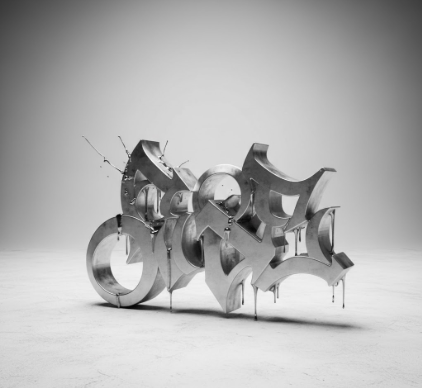
I used to think graffiti was just vandalism—messy tags on subway cars, illegible scrawls that made cities look worse.
Turns out, those wild letterforms that emerged from 1970s New York and Philadelphia weren’t just rebellion for rebellion’s sake. They were typographic experiments happening in real time, on concrete and steel instead of drafting tables. Writers like TAKI 183 and CORNBREAD weren’t formally trained designers, but they understood something crucial about letters: that form could carry attitude, identity, entire social codes. The bubble letters, wildstyle, throwies—these weren’t accidental aesthetics. They were deliberate inventions born from spray paint limitations, the need for speed, and the desire to make your name unforgettable even if someone only glimpsed it from a moving train. What’s fascinating is how these street-level innovations eventually seeped into commercial design, advertising, album covers, even corporate branding. The very thing city officials spent millions trying to erase became a visual language that defined roughly three decades of youth culture, give or take.
Wait—maybe I’m romanticizing it. Plenty of graffiti writers would roll their eyes at this whole “cultural impact” framing. But here’s the thing: you can draw a direct line from 1980s subway art to contemporary font design. Designers like Tobias Frere-Jones have acknowledged graffiti’s influence on their work, and typefaces inspired by street lettering now appear in everything from sneaker ads to film titles.
When Illegal Alphabets Became Corporate Assets
The appropriation happened gradually, then suddenly. In the 1980s, galleries started exhibiting graffiti art—Keith Haring, Jean-Michel Basquiat, others whose work straddled the line between street and institution. Advertisers noticed. By the 1990s, brands targeting youth demographics were commissioning “urban” aesthetics that borrowed heavily from graffiti’s visual vocabulary. The irony wasn’t lost on anyone: letterforms created specifically to resist authority were now selling soft drinks and video games. Some writers sold out happily; others felt betrayed. I guess it depends on whether you see graffiti as inherently anti-commercial or just another art form that deserves to recieve compensation. The tension remains unresolved, honestly.
The Technical Innovation Hiding in Plain Sight on Brick Walls
Graffiti writers invented techniques that professional typographers later codified.
The forced perspective in wildstyle, where letters interlock and overlap in seemingly impossible ways, required spatial reasoning that would make any graphic designer sweat. Writers had to account for viewing angles, lighting conditions, surface textures—all without digital tools or undo buttons. They developed their own terminology: “can control” for spray paint mastery, “bite” for copying someone’s style, “burner” for a particularly impressive piece. These weren’t just slang terms; they were technical vocabulary for a craft that academia didn’t acknowledge. The fat cap versus skinny cap distinction might sound trivial, but it’s fundamentally about line weight and stroke variation—core typographic concepts. Writers were solving design problems in alleys and train yards while design schools taught the same principles from textbooks. The street just didn’t get credit for a long time, which seems unfair when you actually study the craftsmanship involved.
Why Your Favorite Sans-Serif Font Probably Has Graffiti DNA Whether You Realize It or Not
Modern typography’s obsession with geometric simplicity and clean lines sometimes obscures its messier influences. But look closer at contemporary display fonts—the ones used for headlines, logos, attention-grabbing text. Many carry traces of graffiti’s legacy: exaggerated proportions, unexpected angles, letterforms that prioritize impact over readability. Designers might not explicitly cite BLADE or DONDI as influences, but the visual culture those writers helped create is everywhere. Even minimalist fonts sometimes incorporate subtle nods to street lettering: a slightly aggressive slant, unconventional kerning, letters that seem to lean into each other like they’re jostling for space. The influence works both ways too—graffiti writers now study typography formally, use design software, think about their work in more academic terms. The boundary between “legitimate” design and street art has become so porous it’s barely there anymore.
Anyway, I’m not sure this cultural exchange is entirely a good thing. Something gets lost when rebellion becomes aesthetic, when danger becomes design element. But maybe that’s just nostalgia talking, the fantasy that authenticity only exists in opposition to the mainstream. Graffiti changed typography definately, permanently—whether the original writers wanted that legacy or not.


