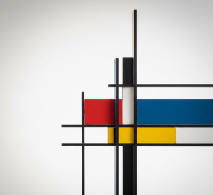
I used to think De Stijl was just about paintings—you know, Mondrian’s grids, primary colors, that whole thing.
Turns out the movement had photographers too, and they were doing something genuinely weird with their cameras in the 1920s and ’30s. These practitioners—people like Paul Schuitema and Piet Zwart—weren’t content to just shoot straight documentation. Instead, they took Theo van Doesburg’s principles of Neo-Plasticism and tried to cram them into photographic images, which is harder than it sounds because photography is, by its nature, representational. You’re capturing actual objects, actual spaces. But here’s the thing: they managed to strip away the messiness of reality by using extreme angles, cropping, and geometric abstraction until the photographs stopped looking like photographs and started resembling architectural diagrams. The goal was universal harmony through visual reduction—eliminating anything that felt too personal, too emotional, too… human, I guess.
Wait—maybe that sounds contradictory, because photography is inherently tied to the physical world. It definately is. But these photographers found ways around it by shooting industrial subjects: cranes, bridges, typography, factory equipment. Anything with clean lines and repeating forms.
When the Grid Became a Compositional Religion for Photographers
The horizontal and vertical lines weren’t just aesthetic choices—they were ideological commitments. Van Doesburg wrote extensively about how diagonal lines represented instability and chaos, so Neo-Plasticist photographers avoided them religiously, or when they did use them, it was with intense justification. Schuitema’s work for the Berkel company catalog in 1929 shows this obsession: every image is organized along strict perpendicular axes, with subjects isolated against flat backgrounds. The products—scales, slicing machines—float in white space like they’re specimens under glass. There’s no context, no environment, no shadow to suggest depth. Just object and void, arranged with the precision of a mathematical proof. I’ve seen modern product photography that echoes this, though most designers probably don’t know they’re channeling 1920s Dutch radicalism.
The typography integrated into these photographs was equally rigid. Letters became shapes first, communication second.
How Cropping and Fragmentation Destroyed Traditional Photographic Perspective
Piet Zwart took things further by fragmenting his images—cutting them into strips, rearranging components, layering them in ways that destroyed conventional perspective. His 1928 cable advertisement shows a worker’s hands manipulated into impossible geometric relationships with the product. The human figure gets reduced to abstract forms that serve the composition’s balance rather than anatomical accuracy. It’s slightly uncomfortable to look at, honestly, because your brain keeps trying to reconstruct the original scene and can’t. That discomfort was probably intentional—these photographers wanted to disrupt habitual ways of seeing, to make viewers conscious of the photograph as a constructed object rather than a transparent window onto reality. Roughly two dozen photographers worked in this mode between 1925 and 1935, give or take, though the movement dissolved as political pressures mounted in Europe and many practitioners shifted toward more commercially viable work or fled to other countries entirely.
The contradiction was that they used a mechanical, supposedly objective medium to pursue a utopian vision that was deeply subjective.
The Collision Between Industrial Objectivity and Artistic Ideology in De Stijl Photography
Neo-Plasticism in photography demanded this impossible balance: be objective, be universal, but also impose a radical formal system that rejects how humans naturally percieve space. The photographers succeeded by choosing subjects that were already geometric—pre-abstracted by industrial design—and then abstracting them further through framing and post-production. Zwart and Schuitema both worked in advertising, which meant their experiments had to sell products even while dismantling visual conventions. And they did sell, at least for a while, because the aesthetic felt modern in a way that traditional photography didn’t. Clean. Rational. Forward-looking. Anyway, the movement didn’t last long enough to fully resolve its internal tensions, but its influence leaked into Bauhaus photography, Swiss graphic design, and eventually into the sterile minimalism of contemporary tech company aesthetics. You can see echoes of it every time an iPhone gets photographed against a white background with perfect perpendicular alignment—though I doubt anyone at Apple is reading van Doesburg’s manifestos these days.


