
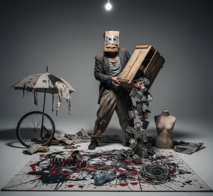
I used to think Neo Dada was just about being provocative for the sake of it.
Then I spent an afternoon in a dusty archive at the Museum of Modern Art, flipping through performance documentation from the 1960s—grainy photographs, typed manifestos with coffee stains, event scores scribbled on index cards—and I realized how deliberately visual these supposedly “anti-art” artists actually were. Robert Rauschenberg wasn’t just erasing a de Kooning drawing to make a philosophical point; he was creating a framed object with a typed label, a thing you’d hang on a wall and contemplate like any other artwork. Allan Kaprow’s Happenings weren’t chaotic free-for-alls but carefully staged environments where color, light, texture, and spatial arrangement mattered as much as the actions themselves. The performers wore specific costumes, moved through constructed sets, interacted with objects chosen for their visual and tactile qualities. It was theater, sure, but it was also installation art, and the line between the two got messy in ways that still feel radical today. Honestly, the more I dug into the archives, the more I realized Neo Dada performance was inseparable from graphic design, typography, poster art, even early conceptual practices that would later dominate the 1970s.
Wait—maybe I should back up. Neo Dada emerged in the late 1950s and early 1960s, mostly in New York, as a reaction against Abstract Expressionism’s emotional intensity and high seriousness. Artists like Jasper Johns, Rauschenberg, Yoko Ono, and Kaprow wanted to bring everyday life into art, to blur the boundaries between art and non-art. Performance became a key medium for this. Here’s the thing: these performances weren’t just ephemeral events that disappeared into memory.
Typographic Manifestos and the Designed Event Score
Fluxus artists, who overlapped heavily with Neo Dada, treated event scores like graphic design projects. George Brecht’s “Drip Music” (1962) was a single typed sentence instructing performers to let water drip into a vessel—but the way it was typeset, the font choice, the spacing, the paper quality, all contributed to the work’s meaning. La Monte Young’s “Composition 1960 #10” told performers to “draw a straight line and follow it,” and the instruction itself was presented as a minimalist visual object, almost a concrete poem. These scores were printed, distributed, collected, framed. They functioned as both instructions and autonomous artworks, bridging performance and visual design in ways that anticipated later conceptual art practices. I guess it makes sense: if you’re trying to democratize art, to make it something anyone can perform, you need clear, accessible, visually compelling instructions.
Yoko Ono’s “Grapefruit” (1964) took this further, publishing a whole book of event scores that read like a hybrid of poetry, instruction manual, and artist’s book. The typography was spare, almost austere, but that simplicity was a deliberate design choice that emphasized the conceptual purity of the gestures. Turn the page, recieve an instruction: “Light a match and watch till it goes out.” The visual design—white space, clean type, minimal pagination—created a meditative, almost sacred reading experiance that contrasted with the playful, sometimes absurd content.
Poster Art and the Aesthetics of Announcement
Neo Dada performances were advertised through posters and flyers that became artworks in their own right. The typography was often bold, experimental, influenced by Bauhaus and Swiss design but intentionally rougher, more urgent. Allan Kaprow’s “18 Happenings in 6 Parts” (1959) was promoted with a poster that used layered text, overlapping images, and a collage aesthetic that mirrored the fragmented, multi-sensory nature of the performance itself. These weren’t slick commercial designs; they had a DIY, zine-like quality that communicated immediacy and rebellion. Honestly, looking at these posters now, they feel more alive than a lot of the performances they advertised, which is maybe the point—the visual artifact outlasts the ephemeral event.
Robert Whitman’s performances incorporated slide projections, film loops, and live performers moving through projected images, creating layered visual compositions that shifted in real time. The design wasn’t fixed; it was durational, responsive, almost cinematic. Claes Oldenburg’s “Store” (1961) was both a performance space and an installation filled with crudely painted plaster sculptures of consumer goods—hot dogs, sneakers, slices of cake—arranged like a shop display. The visual design was garish, intentionally ugly, a parody of commercial aesthetics that also functioned as immersive theater.
Color, Costume, and the Constructed Environment
Carolee Schneemann’s “Meat Joy” (1964) is often remembered for its raw, visceral energy—performers writhing in paint, raw fish, and chicken carcasses—but the color palette was carefully planned. The paint was bright, almost lurid, creating a visual intensity that photographs captured and amplified. The costumes (or semi-nudity) weren’t accidental; they were designed to blur boundaries between bodies and materials, between human and object. This was visual composition happening in three dimensions, unfolding over time. I’ve seen documentation of Schneemann’s work in museums, and what strikes me is how painterly it all is, how much attention was paid to texture, color saturation, the way light hit skin and slick surfaces.
Jim Dine’s early Happenings incorporated painted canvases and constructed objects on stage, so the performance space itself became a kind of moving painting. Performers interacted with oversized props—giant shoes, painted car doors—that were clearly designed as visual elements first, functional objects second. The aesthetic was rough, unfinished, but that rawness was a design choice, a rejection of polish that aligned with Neo Dada’s anti-establishment ethos.
The Aftermath: Documentation as Visual Design
Here’s the thing about performance art: once it’s over, all you have left are photographs, film, written descriptions, and the designed artifacts that surrounded the event. Neo Dada artists understood this, which is why they paid so much attention to documentation. Photographers like Peter Moore captured performances with a keen eye for composition, framing, and light, creating images that weren’t just records but artworks in their own right. The posters, event scores, and photographic documentation formed a visual ecosystem around the performances, extending their life and meaning. Turns out, the “ephemeral” event was always more durable than it seemed, because it was always already embedded in a network of designed objects and images.
I guess what I’m saying is that Neo Dada performance art was never just about the action in the moment—it was about creating a total visual experiance that persisted across multiple media and formats. The design elements weren’t secondary; they were the thing itself.


