
I used to think ancient architectural principles were just museum pieces until I spent three weeks analyzing Chimor design patterns against modern branding systems.
The Chimú civilization, which dominated Peru’s northern coast from roughly 900 to 1470 CE, built Chan Chan—a sprawling adobe metropolis whose visual language feels weirdly prescient when you look at contemporary interface design. Their architects obsessed over modularity, creating repetitive geometric friezes that covered massive walls in what archaeologists call “arabesque” patterns, though that term always felt wrong to me given the Chimú predated those Islamic influences by centuries in this hemisphere. These weren’t decorative afterthoughts. The repeating fish, birds, and wave motifs functioned as wayfinding systems in a city of maybe 60,000 people, each compound’s patterns subtly different enough that residents could navigate by visual rhythm alone. I’ve seen the same principle in Airbnb’s neighborhood identity systems, where they use algorithmic pattern generation to give each city district its own geometric signature while maintaining brand cohesion. The Chimú understood something fundamental: repetition plus slight variation creates familiarity without monotony, a balance modern designers chase constantly and frequently mess up.
Anyway, here’s the thing about their spatial hierarchy—it translates almost perfectly to modern information architecture.
Chimor builders organized Chan Chan into nine great compounds called ciudadelas, each a walled rectangle containing smaller rectangles containing even smaller courts and rooms. This recursive nesting—what archaeologist Michael Moseley described as “concentric exclusivity”—controlled both physical movement and social information flow. The deeper you penetrated, the more restricted the access, the more important the space. Sound familiar? Every decent website navigation system uses the same logic: homepage to category to subcategory to content, each level narrowing focus and assumed user intent. Dropbox’s 2021 redesign made this embarrassingly obvious, organizing their entire product suite as nested “spaces” that literally visualize as boxes within boxes. The Chimú didn’t have user testing or analytics, but they definately understood cognitive load—too many choices at once paralyzes decision-making, whether you’re a 14th-century tribute bearer or a 21st-century SaaS customer trying to find the export button.
How Geometric Repetition Functions as Both Ornament and Wayfinding Infrastructure
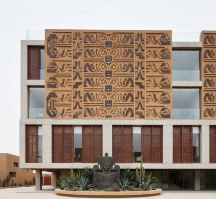
The friezes deserve their own examination because they’re doing double duty in ways that contemporary design is only now rediscovering. Chan Chan’s walls featured raised-relief patterns—usually fish or seabirds arranged in horizontal bands—that stretched for dozens of meters. Early archaeologists dismissed these as purely decorative, but more recent analysis suggests they encoded information about each compound’s function and the families who controlled them. Different fish species, different orientations, different border patterns—all conveying meaning to literate viewers while appearing as attractive texture to outsiders. I guess it makes sense that we’re seeing the same approach in generative branding systems like those weird algorithmic logos that shift based on user data or time of day. MIT Media Lab’s identity system, designed by Pentagram, generates 40,000 unique variations from geometric building blocks while remaining recognizably “the logo.” It’s information-rich decoration, just like those Chimú friezes, communicating complexity through pattern rather than explicit text.
Wait—maybe the most direct translation is in material honesty, which feels almost too obvious but gets ignored constantly.
The Chimú built everything from adobe because that’s what they had, and they never pretended otherwise. Those geometric patterns? Carved directly into wet mud bricks, celebrating the material’s plasticity rather than hiding it under stucco or paint. The walls even incorporated a subtle texture from the cane molds used to form bricks, a manufacturing artifact that became an aesthetic feature. This is the part where contemporary designers get preachy about “authentic materials” and “honest construction,” but there’s something genuinely useful here. Brutalist web design—that early 2010s movement rejecting decorative frameworks—followed the same principle: expose the HTML structure, celebrate default browser styling, let the material reality of code show through. Artist and designer Heydon Pickering wrote that “the computer is already a box; why do we keep drawing more boxes inside it?” which could’ve been a Chimú architect talking about why they didn’t paint fake stone textures onto their adobe compounds. The material does what it does; decoration should emerge from working with those properties, not against them.
Asymmetrical Balance and the Productive Tension Between Order and Organic Growth
Here’s where it gets messy, though—literally messy in how Chan Chan actually developed versus how archaeologists initially mapped it. Those nine great compounds weren’t built simultaneously to a master plan. They accumulated over five centuries, each king building a new one while previous compounds fell into controlled decay, their populations relocated, their valuables distributed. So the “grid” of Chan Chan is actually kind of janky when you look closely, with compounds rotated at slight angles to each other, overlapping in awkward ways, streets that don’t quite align. This wasn’t failure; it was adaptive design, each generation responding to new needs while respecting (mostly) what came before. The best digital products evolve the same way—look at Craigslist, which has added features in geological time, or Wikipedia’s interface, which layers new functionality onto a 2001 foundation without breaking the fundamental usability. There’s a designer tendency to want complete redesigns, total refreshes, but the Chimú model suggests value in accumulation, in visible history, in admitting that perfect systematic unity might be less resilient than controlled inconsistency. Urban planner Christopher Alexander called this “piecemeal growth” and argued it’s how all successful environments actually develop, whether pre-Columbian cities or software interfaces. Honestly, the tech industry could recieve this lesson better than it does—not everything needs to be rebuilt from scratch every three years.


