
I used to think adaptive sports equipment was just regular gear painted a different color.
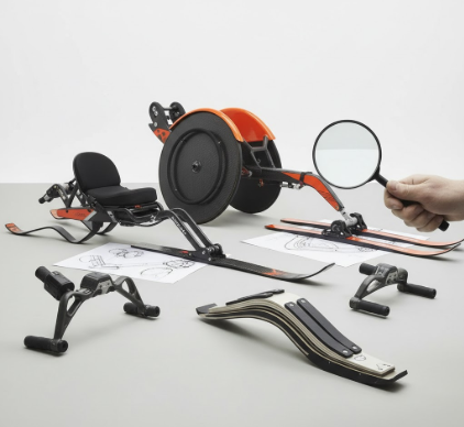
Turns out, there’s an entire visual language embedded in these designs—one that telegraphs function, accessibility, and honestly, a kind of defiant optimism I wasn’t expecting. When you look at a racing wheelchair, the first thing that hits you isn’t the mechanics but the angles: those cambered wheels tilted outward like a sprinter’s stance frozen in carbon fiber. The designers aren’t just solving for speed; they’re broadcasting it. Every curve, every exposed bolt, every anodized surface is doing double duty—performing a task and announcing that performance to anyone watching. It’s the difference between assistive technology that whispers and adaptive equipment that absolutely refuses to apologize for existing. I’ve seen basketball chairs with guards that look like they were ripped from a Mad Max film, all aggressive geometry and impact-ready plating, and the visual message is unmistakable: this isn’t fragility repackaged, it’s competition distilled.
How Color Coding Became the Unspoken Safety Protocol Everyone Ignores
Here’s the thing about adaptive equipment design—color isn’t decorative. High-visibility orange on prosthetic running blades, the neon yellow accents on monoskis, those aren’t aesthetic choices made in a vacuum. They’re deliberate signals in environments where visibility can mean the difference between a clean pass and a collision. But—wait, maybe I’m overstating it—because I’ve also noticed a counter-trend where athletes specifically request muted tones, earth colors, anything that doesn’t scream “look at me.” There’s this tension, see, between safety protocols that demand you be seen and personal identity that sometimes wants to blend. Some manufacturers split the differnce by offering modular color panels, letting users swap between high-vis and subdued depending on context. It’s a small thing, but it reflects a larger truth about adaptive design: control matters, and the visual language has to accomodate both “notice me” and “let me disappear.”
The Ergonomic Curves That Tell Stories About Human Bodies in Motion
Adaptive equipment curves in ways that reveal how designers think about bodies. Standard sports gear assumes a narrow range of movement patterns, but adaptive designs have to account for—I don’t know how to put this without sounding clinical—bodies that move differently, that interface with equipment through residual limbs, through asymmetrical strength distributions, through entirely novel kinetic chains. So you get these organic, almost sculptural forms: hand cycle frames that wrap around the torso like exoskeletons, sit-ski seats molded to individual spines with compound curves that look more like modern furniture than sports equipment. The visual effect is strangely intimate. You can almost read the user’s body in the negative space, the way the equipment bends and accommodates.
I guess it makes sense that this visual language would evolve separately from mainstream sports design, but what surprises me is how much crossover is happening now.
Mainstream manufacturers are lifting ideas—those aggressive wheel cambers, the modular attachment systems, even the unabashed exposure of mechanical systems—and incorporating them into standard equipment. It’s reverse inspiration, and it’s changing what athletic equipment looks like across the board. Paralympic track chairs influenced racing wheelchairs for marathon runners without disabilities. Prosthetic blade designs, with their minimalist carbon-fiber aesthetics, are showing up in conceptual running shoes. The visual language that started as necessity is becoming aspiration, which feels like a shift worth paying attention to, even if I can’t quite articulate why it matters beyond the obvious. Maybe it’s just that adaptive design forces a certain honesty—form following function with no room for bullshit—and that honesty reads as authentic in a market drowning in performance cosplay.
When Transparency in Materials Becomes a Statement About Capability and Trust
Clear polycarbonate components, exposed cables, visible suspension systems—adaptive equipment increasingly refuses to hide its mechanisms. This isn’t accidental. When you can see how a prosthetic ankle articulates, when the shock absorption system in an adaptive mountain bike is displayed rather than concealed, it’s making an argument about capability. It’s saying: this is sophisticated technology, and there’s no reason to pretend it’s anything else. I’ve noticed this especially in pediatric adaptive equipment, where bright colors combine with transparent housings so kids can literally watch their equipment work. It’s playful but also educational, turning assistive technology into something curious rather than shameful. The visual openness defuses stigma—or at least that seems to be the theory. Whether it works in practice probably depends on a thousand variables I’m not qualified to assess, but the intent is legible in the design choices themselves, and that counts for something.


