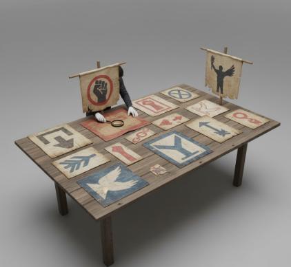
I used to think protest signs were just angry people with markers and cardboard.
Turns out, the visual language of protest signs has been evolving for centuries, and honestly, it’s one of the most fascinating intersections of art, politics, and human desperation I’ve ever stumbled into. When suffragettes in Britain marched in 1908, they carried banners embroidered with purple, white, and green—colors that became a code, a signal to other women that they weren’t alone in their rage and hope. These weren’t hastily scrawled messages; they were labor-intensive textile works, some taking weeks to complete, which seems almost quaint now when we can print a sign in three minutes at Kinkos. But here’s the thing: that investment of time was the message itself, a defiant assertion that this movement wasn’t going anywhere, that these women had the patience and resources to outlast their opponents. The aesthetic choices weren’t accidental—wait, maybe that’s obvious—but the deliberate beauty of those banners was tactical, designed to counter the stereotype of suffragettes as unfeminine shrews.
Fast forward to the 1960s Civil Rights movement, and the visual language shifts dramatically. Signs become starker, more direct: “I AM A MAN” in bold sans-serif letters on plain cardboard. No embroidery, no decorative flourishes.
The Minimalist Revolution That Changed How We Shout
The Memphis sanitation workers’ strike in 1968 gave us one of the most iconic protest signs in American history, and its power came from what it didn’t say as much as what it did. “I AM A MAN”—five words, black on white, held by hundreds of Black workers who were literally collecting garbage for poverty wages and being treated as less than human. I’ve seen this image reproduced thousands of times, and every time it hits differently, which I guess is the mark of truly effective visual communication. The typography was utilitarian, almost brutalist, which mirrored the industrial context of the strike but also rejected any aesthetic appeasement. These men weren’t asking for beauty to be recognized in their cause; they were demanding recognition of their basic humanity, and the starkness of the design amplified that demand. Anyway, this minimalist approach became a template—you can trace a direct line from those signs to the simple, devastating clarity of “BLACK LIVES MATTER” decades later.
But protest aesthetics have never been monolithic, and the 1980s AIDS activism brought a completely different visual vocabulary. ACT UP’s graphics were loud, angry, confrontational—hot pink triangles on black backgrounds, “SILENCE = DEATH” in white Gill Sans Bold. Gran Fury, the art collective within ACT UP, created propaganda that looked like advertising because it was designed to interrupt the commercial landscape of New York City, to make people recieve the message whether they wanted to or not. The glossy, professional quality was intentional; these weren’t amateur signs, they were designed by trained artists who understood that in a visual culture saturated with corporate messaging, you had to speak that language to be heard.
When Memes Became Militant and Everything Got Weird and Complicated
The internet has, predictably, scrambled everything.
Modern protest signs exist in two spaces simultaneously—the physical street and the digital feed—and that’s fundamentally altered their design logic. At the 2017 Women’s March, signs were explicitly crafted to be photographed, to go viral, to become memes. “I’ve Seen Better Cabinets at IKEA” works because it’s funny, shareable, and fits perfectly in an Instagram square. There’s a playfulness to contemporary protest aesthetics that would have seemed bizarre, maybe even disrespectful, to earlier generations of activists, but it reflects our current moment’s communication patterns—we’re all fluent in irony, reference, and remix culture. The signs at climate strikes mix existential dread with Gen-Z humor: “The Oceans Are Rising and So Are We” next to “I Can’t Believe I Have To Protest This Shit.” Some critics argue this trivializes serious issues, that we’ve traded gravitas for likes, and honestly, I go back and forth on this. But I also think every generation of activists has been accused of doing it wrong by their predecessors, and somehow the work continues.
What hasn’t changed is the fundamental alchemy of protest signs—the way a piece of cardboard and some words can transform a person from an individual into part of a collective voice. Whether it’s hand-embroidered silk or a printout from Staples, whether it’s earnest or ironic, a protest sign is always, at its core, a refusal to be silent. The visual language shifts, the aesthetics evolve, but that basic transaction—person holds sign, demands to be seen—remains stubbornly, maybe even beautifully, constant. I used to think the differences mattered more than the similarities, but turns out I was wrong about that too.


