
I used to think packaging was just about keeping cereal from going stale.
Then I watched a friend’s kid have a full meltdown in the grocery store—not because he couldn’t have the cookies, but because the box was too loud. The colors, I mean. Literally too loud, if that makes sense, which it didn’t to me at the time. But here’s the thing: sensory friendly packaging design has become this whole subdiscipline of visual communication theory, and honestly, it’s reshaping how we think about what makes a product approachable. Researchers at the Centre for Inclusive Design in Australia documented roughly 1 in 6 people—give or take—experiencing some form of sensory processing sensitivity, and that’s not even counting folks who just get overwhelmed by visual noise when they’re tired or stressed. The standards emerging from this field aren’t charity work or accessibility afterthoughts; they’re a recalibration of what “good design” actually means when you acknowledge that human perception is messy and wildly variable.
Wait—maybe I should back up. Sensory friendly doesn’t mean boring.
The Cromatics of Calm (And Why Beige Isn’t the Answer)
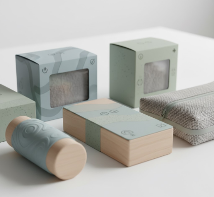
Color theory for sensory sensitive packaging walks this weird tightrope between psychological research and aesthetic intuition. You’d think the solution would be muting everything to pastel oblivion, but designers working with autistic focus groups—like the team at the University of Cambridge’s Autism Research Centre—found something more nuanced: it’s not brightness or saturation alone that triggers overwhelm, it’s contrast ratios and pattern density. High-contrast edges create what one researcher called “visual static,” this cognitive load that accumulates before you even register what you’re looking at. So brands like Tesco’s “Quiet Hour” product line use mid-tone palettes with softer transitions between color fields, avoiding those sharp borders that make your brain work overtime to parse where one thing ends and another begins. The Pantone-adjacent color systems they’re developing have names like “Diffused Coral” and “Suspended Blue”—colors that feel definately present but don’t demand attention. Which sounds contradictory for packaging trying to sell product, except it turns out that reducing cognitive friction increases dwell time. People actually look longer at these designs because they don’t have to look away.
Typography That Doesn’t Scream at Your Amygdala
Font choice became this unexpected battleground. I guess it makes sense—letters are just tiny complex shapes we force our brains to decode instantaneously, over and over. The British Dyslexia Association’s style guide, which overlaps substantially with sensory friendly typography standards, recommends sans-serif typefaces with distinct letterforms (the ‘a’ shouldn’t look like a reversed ‘d’), generous spacing, and absolutely no italics or decorative flourishes for essential information. But here’s where it gets weird: some “dyslexia friendly” fonts like OpenDyslexic actually performed worse in sensory sensitive testing because the weighted bottoms on letters created visual rhythm patterns that became distracting at scale. The current gold standard seems to be unglamorous workhorses like Helvetica Neue or Atkinson Hyperlegible—the latter designed by the Braille Institute, which brings its own irony to visual design. Size matters too, obviously, but not linearly; there’s a sweet spot around 14-16pt for body text where legibility peaks before bigness becomes its own form of aggression. Anyway, the neuropsychology research from MIT’s AgeLab suggests our brains process familiar letterforms about 200 milliseconds faster than ornate ones, and when you’re already spending extra cognitive budget managing sensory input, those milliseconds compound into the difference between “I can shop here” and “I need to leave now.”
Pattern Density and the Paradox of Information Architecture
This is where I find the whole thing kind of exhausting, intellectually—sensory friendly packaging has to communicate everything standard packaging does (ingredients, branding, legal disclaimers, that weird little recycling symbol nobody understands) while reducing visual complexity. The solution, according to design firms like Elmwood and Jones Knowles Ritchie, involves brutal information hierarchy. One focal point. Maybe two if you’re pushing it. Everything else recedes into background fields with minimal texture. No gradients, no overlapping elements, definitely no faux-3D effects or drop shadows that create depth ambiguity. The International Organization for Standardization’s draft guidelines—ISO/DIS 9241-143, if you’re keeping track—recommend negative space comprising at least 40% of the visible surface, which sounds spacious until you try designing a shampoo bottle that needs to list seventeen chemical compounds and three certification logos. Some brands cheat by moving information to interior surfaces or secondary packaging, which works until someone argues that’s not truly accessible if you need the information before purchase. There’s no clean solution; it’s compromise layered on compromise.
Texture, Finish, and the Stuff You Feel Before You See
Turns out visual language isn’t purely visual. The tactile dimension of packaging—matte versus gloss, embossing, that weird rubberized coating some products have—primes how we interpret the visual information before we consciously register it. Glossy finishes create specular highlights that shift with movement, which some sensory researchers classify as “unstable visual stimulus.” Matte and soft-touch finishes absorb light more uniformly, reducing those micro-fluctuations in brightness that can trigger discomfort. But again, it’s not universal; some individuals find matte finishes visually “muddy” or harder to focus on. The design studio Pearlfisher ran consumer testing where participants wore eye-tracking gear while handling packages, and the data showed people with sensory sensitivities spent 30% more time fixating on texture transitions—like where a label meets the base material—compared to neurotypical subjects. So now there’s this emerging principle of “haptic continuity,” trying to minimize tactile seams that create visual boundaries your brain has to process.
When Standards Become Straitjackets (And Why That Might Be Fine)
I’ve seen the backlash from conventional designers who think sensory friendly guidelines are aesthetically limiting, that we’re sanding off design’s expressive edges. And yeah, there’s something a little dystopian about optimizing visual communication for maximum cognitive efficiency—it’s very Brutalist, very mid-century “form follows function” but applied to neuroscience instead of architecture. The Neurodiverse Design Initiative at Stanford argues that’s exactly the point: design should default to inclusive, not use accessibility as a special accommodation. When you build sensory friendliness into base standards—like the EU’s upcoming packaging regulations under the European Accessibility Act—you’re not creating a separate ghetto of “accessible products,” you’re just making better products. Period. Though I’ll admit, walking through a grocery store where everything follows these principles feels slightly uncanny, like someone turned down the visual volume on reality itself.
Maybe that’s not such a bad thing.


