
Author: Alexandra Fontaine, Visual Strategist and Design Historian

I used to walk past medicine cabinets without thinking twice about the little boxes stacked inside. Then I spent three months interviewing package designers
Typography tracking—the space between letters—shifts how dense text feels on a page. I used to think tracking was just one of those fiddly design things
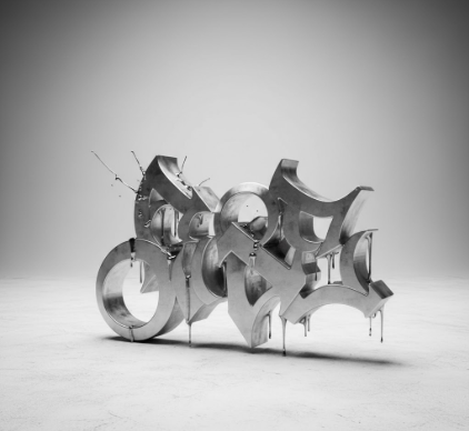
I used to think graffiti was just vandalism—messy tags on subway cars, illegible scrawls that made cities look worse. Turns out, those wild letterforms

I used to think cloisonné was just about enamel and metal—those intricate Byzantine jewelry pieces my aunt used to collect, compartments filled with crushed

I used to think postage stamps were just boring little rectangles you stuck on envelopes. Turns out, they’re actually one of the most fascinatingly

I used to think car logos were just about looking expensive. Turns out the entire visual system behind automotive branding operates more like a language—one that’
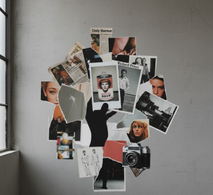
I used to think appropriation in art was this clear-cut theft scenario, you know? But then I started looking at the Pictures Generation—this loose collective

I used to think regionalism in art was just about painting local barns and cornfields. Turns out, it’s way messier than that—and honestly, more interesting.

I used to think Art Nouveau was just about curvy letters on old posters. Turns out, between roughly 1890 and 1910—give or take a few years depending on

I used to think political posters were basically just propaganda with better fonts. Then I spent three months in a Moscow archive—this was 2019, pre-everything—flipping