
Designer Things
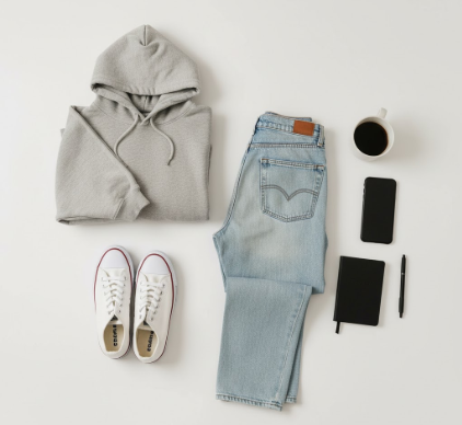
Normcore design didn’t arrive with a manifesto—it sort of seeped into the visual landscape around 2013, when everyone was exhausted from maximalist branding.

The thing about sad girl aesthetic is that nobody really set out to create a movement. It sort of happened accidentally, somewhere between Tumblr’

I used to think vulture culture was just about people collecting bones. Turns out, it’s way more complicated than that—and honestly, kind of fascinating
I used to think vernacular photography was just a fancy term for snapshots people didn’t care about. Turns out, the entire history of how we document
Designer Things
The Secession building in Vienna still catches me off guard every time I walk past it—this squat, almost defiant structure with its golden dome of laurel
Designer Things
I used to think land grant documents were just bureaucratic paperwork—boring rectangles of text that nobody cared about once the ink dried.
Designer Things
The letters swim. That’s what my friend Sarah told me when she first described reading with dyslexia, and I’ve carried that image with me for
Designer Things
I used to think Victorian fonts were just, you know, decorative choices. Turns out the typefaces plastered across nineteenth-century London—from ornate
Designer Things
I used to think descenders were just the lazy tails on letters like ‘g’ and ‘y’—things that hung below the baseline because, well
Designer Things
Red means revolution, blue signals stability, and green—well, green’s gotten complicated. I’ve spent way too many hours staring at political