
Designer Things

I used to think visual metaphors in advertising were just clever shortcuts—like, the brand couldn’t explain their product properly so they showed

I used to walk past medicine cabinets without thinking twice about the little boxes stacked inside. Then I spent three months interviewing package designers

I used to think balletcore was just another TikTok trend that would vanish by spring. But here’s the thing: the aesthetic has roots that twist back
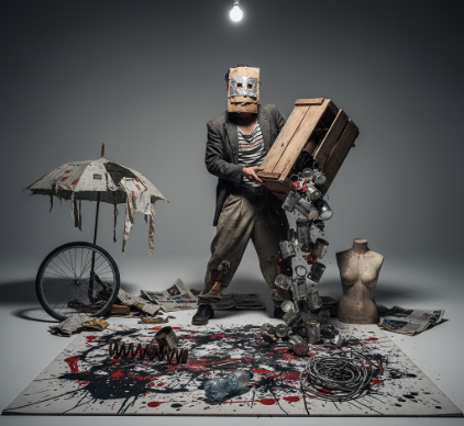
I used to think Neo Dada was just about being provocative for the sake of it. Then I spent an afternoon in a dusty archive at the Museum of Modern Art
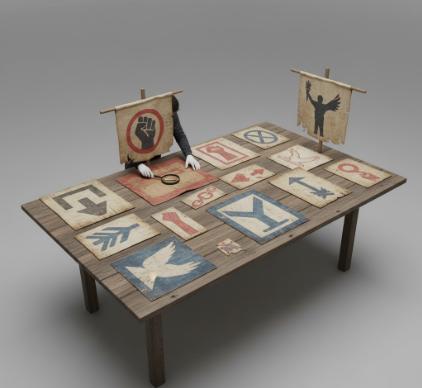
I used to think protest signs were just angry people with markers and cardboard. Turns out, the visual language of protest signs has been evolving for
Typography tracking—the space between letters—shifts how dense text feels on a page. I used to think tracking was just one of those fiddly design things

I used to think sustainable packaging was just about slapping a green leaf on a cardboard box and calling it a day. Turns out, the visual strategy behind

I used to think cubism died with Picasso and Braque, filed away in some dusty corner of art history where radical ideas go to retire. Turns out, the fragmented
I used to think Impressionism was just about painting outside. Turns out, the real revolution happened in how artists started seeing—and mixing—color itself.
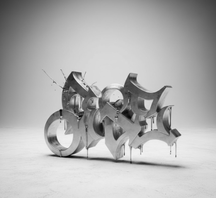
I used to think graffiti was just vandalism—messy tags on subway cars, illegible scrawls that made cities look worse. Turns out, those wild letterforms