
Designer Things
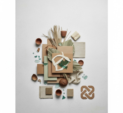
I used to think sustainable brands just slapped a leaf on their logo and called it a day. Turns out, the visual language of zero waste product brands is

I used to think Art Nouveau was just about curvy letters on old posters. Turns out, between roughly 1890 and 1910—give or take a few years depending on

I used to think sustainable design was just about recycling logos and green color palettes. Turns out, the philosophy behind sustainable visual communication

I used to think documentary filmmakers just pointed cameras at reality and pressed record. Then I spent three months watching grainy footage from the 1930s—miners

I used to think allergen labels were just about listing ingredients in tiny print at the bottom of packages. Turns out, there’s this whole universe
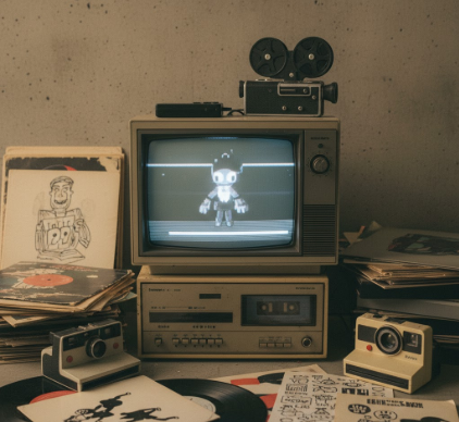
Lo-fi wasn’t supposed to be an aesthetic—it was supposed to be a limitation. Back in the late 90s and early 2000s, before everyone had a pocket-sized

I used to think political posters were basically just propaganda with better fonts. Then I spent three months in a Moscow archive—this was 2019, pre-everything—flipping

Typography hierarchy isn’t just about making things look pretty—it’s about survival in information overload. I used to think that font sizes

I used to think cottagecore and academia were fundamentally incompatible aesthetics—one all wildflowers and sourdough starters, the other buried in dusty
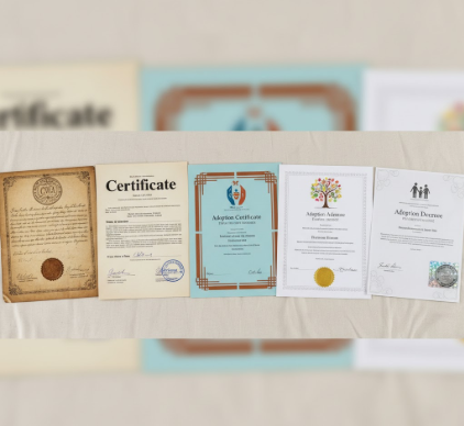
I used to think adoption certificates were just bureaucratic afterthoughts—bland documents stamped out by whatever printing press happened to be closest