
Designer Things
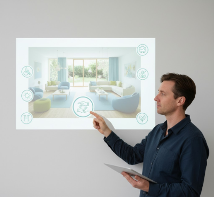
I used to think dementia-friendly design was just about putting up handrails and painting walls beige. Turns out, the visual language of environments designed

I used to think contrast was just about making things different from each other. Then I spent an afternoon in the Musée d’Orsay staring at a Degas

I used to think Rococo was just excessive decoration for people with too much money and terrible taste. The Asymmetrical Shell Motif That Changed Everything

I used to think music app design was just about looking cool. Turns out, the visual architecture of streaming platforms—Spotify’s gradient cards
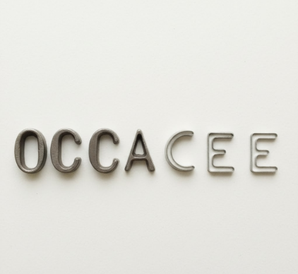
I used to think letters were just shapes—clean, predictable, boring. Then I spent three months interviewing typographers, squinting at magnified serifs

I used to think photography was about freezing moments—clean, precise, untouchable. Then I spent an afternoon in a cramped gallery in Berlin, sometime
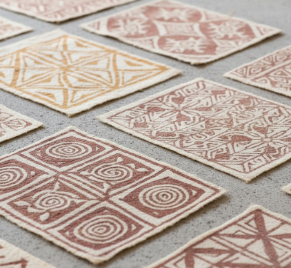
I used to think bark cloth was just, you know, some rustic craft thing—until I saw authentic Hawaiian kapa up close at a museum in Honolulu, patterns so
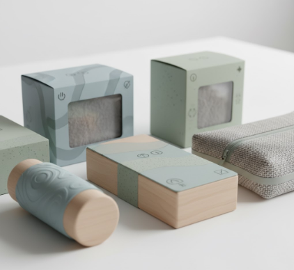
I used to think packaging was just about keeping cereal from going stale. Then I watched a friend’s kid have a full meltdown in the grocery store—not

I used to think pointillism died with Seurat. Turns out, the technique never really vanished—it just migrated from canvas to screen, from oil paint to

I used to think the Nasca Lines were just ancient tourist bait—you know, those giant drawings in the Peruvian desert that only make sense from a plane.