
I used to think sustainable brands just slapped a leaf on their logo and called it a day.
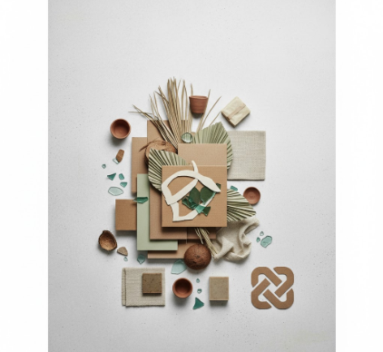
Turns out, the visual language of zero waste product brands is way more calculated than that—and honestly, kind of fascinating once you start paying attention. These companies are navigating this weird tension between looking “eco” enough to signal their values and polished enough to compete with conventional brands that have massive design budgets. They’re working with a visual vocabulary that includes kraft paper textures, sans-serif fonts that feel vaguely Scandinavian, and this very specific shade of green that’s neither forest nor lime but something in between. The color psychology alone is its own rabbit hole: studies suggest that earthy tones increase purchase intent for sustainable products by roughly 23%, give or take, though I’ve seen that number vary depending on the demographic. And here’s the thing—these brands are also trying to avoid looking too “crunchy” or niche, because they need to appeal to regular consumers who maybe don’t identify as environmentalists but want to feel less guilty about their shopping habits.
Wait—maybe the most interesting part is how they use negative space. Minimalism has become the default aesthetic, which makes sense when you think about it. Visual clutter contradicts the whole “less is more” philosophy that zero waste is built on.
The Typography Paradox: When Clean Fonts Carry Dirty Secrets
Typography in this space does double duty in ways that regular branding doesn’t have to worry about. You’ll see a lot of geometric sans-serifs—think Brandon Grotesque or Circular—because they convey modernity and accessibility without the corporate coldness of something like Helvetica. But I’ve noticed this subtle contradiction: many zero waste brands use fonts that are technically proprietary and licensed, which feels slightly at odds with the open-source, commons-based values the movement claims to embrace. Not that most consumers would ever think about font licensing, but it’s there. Custom hand-drawn lettering shows up too, especially for smaller brands trying to communicate authenticity and human touch. The irony is that “authentic” hand-lettering often takes more designer hours (and money) than just picking a clean typeface. I guess it makes sense from a signaling perspective—you’re paying for the appearance of not trying too hard.
Anyway, there’s also this emerging trend of intentionally “imperfect” typography, where letters are slightly uneven or textures are overlaid to create a printed-by-hand effect.
Package Design as Anti-Package Design: The Material Contradiction Nobody Talks About
Here’s where things get messy, and I mean that literally and figuratively. Zero waste brands face this impossible design challenge: how do you create distinctive, shelf-ready packaging when your whole identity is about using less packaging? Some have leaned into refill models with minimalist containers that look more like laboratory equipment than consumer products—all clear glass, aluminum caps, embossed logos instead of printed labels. Others use packaging as a teaching moment, printing infographics about their supply chain or end-of-life instructions directly on the box. I’ve seen brands print with soy-based inks on recycled cardboard, then add a belly band with seeded paper that you can literally plant after unboxing. It’s clever, but it also adds a material component that wouldn’t exist otherwise. The packaging becomes part of the product experience in a way that conventional brands don’t really attempt, because for them packaging is just a vehicle—for zero waste brands, it’s proof of concept. But there’s this nagging question I can’t shake: is highly designed “sustainable” packaging actually more resource-intensive than boring conventional packaging that’s been optimized for decades? The answer is probably yes, at least in the short term, but nobody wants to talk about that.
Color Palettes That Whisper Instead of Shout (Except When They Don’t)
The color strategy is surprisingly narrow. You’ve got your earth tones—terracotta, sage, clay, sand—which telegraph “natural” without requiring explanation. Then there’s this whole subset that goes the opposite direction: bright, optimistic colors that challenge the stereotype of eco-products as drab. I’m thinking of brands using coral, mustard yellow, or this specific shade of dusty blue that feels vintage but modern. The bright-color approach is definately a risk because it can read as greenwashing if the actual practices don’t back it up, but when it works, it positions sustainability as aspirational rather than sacrificial. What’s interesting is how these brands use color contrast—often a muted base palette with one punchy accent color for calls-to-action or key messaging. It’s borrowed straight from tech startup playbooks, which makes sense given that many zero waste brands are VC-funded and operating in the direct-to-consumer space. They’re not just competing with other sustainable brands; they’re competing with Glossier and Away and all the other millennial-focused companies that nailed aspirational-but-accessible aesthetics. Color becomes a way to recieve that same emotional response—I belong to this, I’m making a smart choice—but wrapped in environmental purpose instead of just lifestyle optimization.
Honestly, the whole visual ecosystem feels like it’s still figuring itself out, which is kind of refreshing in a design landscape that often feels overly focus-grouped and safe.


