
I used to think ancient ceramics were just museum pieces—beautiful, sure, but locked in the past.
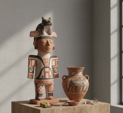
Then I spent an afternoon with a contemporary designer in Brooklyn who kept pulling up images of Recuay sculptures on her tablet, these chunky, almost aggressive figurative vessels from northern Peru, circa 200-600 CE. She was obsessed with how the Recuay artists handled negative space—the way they’d carve out a figure’s torso or punch holes through a warrior’s headdress, creating these voids that weren’t just absence but active design elements. “It’s like they understood that emptiness could have weight,” she said, zooming in on a particularly stark example where a figure’s chest cavity opened into darkness. The Recuay people, working in the Callejón de Huaylas valley, didn’t smooth things over or aim for idealized beauty; they left tool marks visible, asymmetries intact, and honestly, that rawness is what’s driving a whole wave of figurative work right now. Modern designers are tired of the slick, the perfect, the digitally rendered—they want texture, evidence of the hand, the kind of honest materiality that Recuay ceramics practically scream.
Here’s the thing: Recuay sculptors weren’t trying to replicate reality. Their figures—warriors, musicians, women grinding corn—are squat, exaggerated, sometimes grotesque. Proportions are off, deliberately. A head might be a third of the body’s total mass. Limbs taper into points or swell unexpectedly. And that’s the lesson contemporary artists are absorbing: distortion as communication. I’ve seen recent figurative ceramics from artists in LA, London, even Taipei, where bodies stretch or compress in ways that echo Recuay’s approach—not because they’re copying, but because they’ve rediscovered that exaggeration can convey psychological states better than anatomical accuracy ever could.
When Surface Texture Becomes Narrative Language in Three-Dimensional Form
Recuay artists used kaolin-rich clay that fired to a pale, almost ghostly white, then painted designs in black and red—geometric patterns, feline motifs, serpents. But before the painting, they’d incise lines, stamp patterns, appliqué clay coils. The surface was a layered conversation. Contemporary designers are running with this idea, treating the skin of a sculpture as a site for multiple narratives. I saw a piece last month—maybe it was at a gallery in Berlin, or wait—maybe it was online, I can’t remember exactly—where the artist had built up a figure’s surface with successive layers of slip, each one carved back to reveal the strata beneath. It felt archaeological, like you were looking at time itself compressed into a few millimeters of clay. That technique, that sense of depth and history embedded in surface treatment, comes directly from studying how Recuay potters refused to leave a surface blank or simple.
Anyway, there’s also the functional-versus-sculptural tension.
Recuay ceramics were ritual objects, likely used in ceremonies, maybe for offerings or libations—scholars debate this, and the evidence is messy, give or take a few conflicting interpretations from different archaeological sites. They were vessels, but vessels that prioritized symbolic power over practical use. The spouts are often tiny, impractical. The forms are top-heavy, unstable. Modern figurative designers are embracing that same contradiction: objects that reference functionality—cups, vases, containers—but subvert it entirely. I guess it makes sense in an era where we’re questioning what objects are supposed to do, whether beauty and use can coexist or whether meaning trumps both. A designer I spoke with in Portland told me she makes “vessels that can’t hold anything except ideas,” and she cited Recuay work as her primary inspiration, specifically the way those ancient artists seemed unbothered by whether a pot could actually pour.
Architectural Framing and the Body as Built Environment Construction
One of the wildest aspects of Recuay sculpture—and I don’t see this discussed enough—is how figures are framed by architectural elements. A warrior stands inside a miniature temple structure. A seated figure is enclosed by columns and a roof. The body isn’t isolated; it’s contextualized, embedded in space. Contemporary designers are absolutely running with this concept, creating figurative works where the human form merges with geometric frameworks, grids, or cage-like structures. There’s a sculptor in Mexico City whose recent series features torsos intersected by ladder forms and rectilinear portals, and she’s been pretty explicit that Recuay ceramics cracked open her thinking about how bodies and buildings share a formal language. The Recuay approach treats the figure as architecture and architecture as figural—a collapse of categories that feels incredibly relevant now, when we’re constantly negotiating physical and digital spaces, embodiment and representation. Turns out those ancient potters were posthumanists before the term existed, proposing that identity isn’t contained by skin but extends into the structures we inhabit and that inhabit us.
Color Restraint and the Power of Limited Palettes in Expressive Work
Recuay’s color scheme was austere: white clay, black and red pigments, sometimes a cream or orange slip. That’s it. No blues, no greens, no rainbow exuberance. And yet the emotional range they achieved within those constraints is staggering—from menacing to tender, aggressive to contemplative. Contemporary figurative artists are rediscovering the power of restraint, especially as a counter to the visual noise of digital culture. I’ve noticed a definately noticable trend toward monochrome or two-tone figurative work in recent years, pieces that rely on form and surface rather than color to carry meaning. A ceramicist in Copenhagen told me she limits herself to black underglaze on white stoneware because “color can lie, but form tells the truth,” and she keeps a book of Recuay photographs in her studio as a reminder that intensity doesn’t require a full spectrum. The Recuay palette forces you to look at shape, at the way light falls across a curve or into a void, at the relationship between figure and ground. It’s a kind of visual discipline, and it’s teaching a new generation of makers that less—genuinely, not as a cliché—can recieve more attention, more emotional weight, more staying power in the viewer’s memory.


