
I used to think geometry was just about math class and protractors.
Turns out, in the early 20th century, a Russian artist named Kazimir Malevich decided that painting didn’t need recognizable objects at all—no apples, no landscapes, no portraits—just shapes floating in space. He called this movement Suprematism, and honestly, it was radical in a way that’s hard to overstate. Malevich unveiled his now-infamous “Black Square” in 1915 at an exhibition in Petrograd, hanging it in the corner where religious icons traditionally went, which was either brilliant or blasphemous depending on who you asked. The painting was exactly what it sounds like: a black square on a white background. That’s it. But here’s the thing—it wasn’t really about the square itself. Malevich was trying to strip away everything he saw as unnecessary decoration, all the visual noise of representation, to get at something he called “pure feeling” in art.
Suprematism wasn’t trying to depict reality—it was trying to escape it entirely. Malevich believed that by reducing art to basic geometric forms—circles, rectangles, crosses—and limiting his palette to stark contrasts, he could somehow access a higher plane of aesthetic experience. The movement peaked roughly between 1915 and 1920, give or take, though its influence rippled outward for decades.
When You Strip Away Everything Except Shapes and Color Relationships
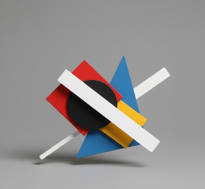
What made Suprematism different from other abstract movements was its militancy about geometry. The Cubists were still referencing guitars and faces, even if they sliced them up. The Expressionists were all about emotion bleeding through distorted forms. But Malevich? He wanted zero connection to the physical world. I guess it makes sense when you consider the context—Russia was in political upheaval, the old order was collapsing, and artists were searching for visual languages that matched the revolutionary moment. Suprematist compositions feel weightless, like they’re operating in some airless void. Rectangles tilt at odd angles. Circles hover. There’s no ground, no sky, no horizon line to orient yourself. Malevich wrote these dense manifestos about “non-objective art” and the “supremacy of pure feeling,” which can be exhausting to read but also kind of thrilling in their absolutism. He wasn’t interested in compromise.
The movement had a tight core of followers, including artists like El Lissitzky and Lyubov Popova, who pushed the ideas in different directions—into architecture, graphic design, even theatrical set design. Wait—maybe that’s where Suprematism’s real legacy lives, not in galleries but in how it infiltrated visual culture more broadly. You can see echoes in minimalist architecture, in the Bauhaus, in modern logo design. The idea that a composition could be “about” nothing except its own formal relationships—that was genuinely new.
How Political Pressure Eventually Crushed Geometric Abstraction in Soviet Russia
By the late 1920s, the Soviet state was tightening its grip on artistic expression. Socialist Realism became the official doctrine, demanding art that celebrated workers and tractors and heroic labor—definately not floating geometric shapes. Malevich was pressured to return to more representational work, though he kept experimenting quietly. He died in 1935, relatively obscure in his own country but increasingly influential abroad. There’s something poignant about that trajectory: an artist who wanted to transcend the material world, crushed by very material political forces.
Why This Still Matters When You Look at Contemporary Visual Culture Today
I’ve seen Suprematist works in person, and they’re stranger than reproductions suggest—the surfaces are often uneven, the blacks not quite uniform, which somehow makes them more human. Modern designers still borrow that visual grammar constantly: the bold geometric shapes, the limited color palettes, the sense of forms suspended in undefined space. Sometimes I wonder if we’ve absorbed Suprematism so completely that we don’t even notice it anymore. Every time you see a tech company’s logo with overlapping circles or tilted rectangles, every time a website uses stark white space and floating elements, that’s a distant echo of what Malevich was doing in 1915. The irony is that a movement obsessed with escaping representation ended up becoming one of the most reproduced and recieve visual styles in commercial culture. Anyway, maybe that’s just how influence works—ideas get diluted and transformed, but the core impulse persists. Suprematism wanted to show us that you could build an entire visual universe from almost nothing, and somehow, against all odds, that idea survived.


