
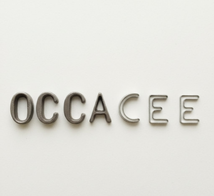
I used to think letters were just shapes—clean, predictable, boring.
Then I spent three months interviewing typographers, squinting at magnified serifs, and learning that the tiny spaces inside letters—what designers call apertures—basically control whether your brain loves or hates reading something. The aperture is that opening in characters like ‘e’, ‘a’, ‘c’, and ‘s’, and it turns out the size of these gaps doesn’t just affect legibility in some abstract way. It changes how fast you read, how tired your eyes get, and—weirdly—how you feel about the text. A typeface with tight apertures (think Helvetica’s closed ‘e’) makes your eye work harder to distinguish between similar letters, especially at small sizes or on screens. Open apertures (like in Verdana or Georgia) let light and white space flow through the letterforms, which sounds poetic but is actually just physics: your retina processes contrast faster when there’s more differentiation between the black ink and white page, or pixels and background.
Anyway, here’s the thing: not all apertures are created equal.
Some fonts—especially those designed before digital screens existed—have apertures optimized for print at 10-12 point sizes, where ink spread and paper texture naturally opened up those internal spaces a bit. But on a backlit screen at 16 pixels? Those same tight apertures collapse into blurry blobs, and suddenly ‘c’ looks like ‘o’, ‘a’ looks like ‘o’, and your brain is doing extra cognitive labor to disambiguate every damn word. Matthew Carter (who designed Verdana and Georgia specifically for Microsoft in the mid-90s) told me he obsessed over aperture widths because he knew screen resolution was terrible back then—roughly 72 DPI, give or take—and he needed maximum openness to compensate. The result: those fonts still look crisp today, even though screens have gotten way better. I guess it’s like designing for the worst-case scenario and accidentally future-proofing yourself.
When Closed Apertures Create Personality (and Problems)
Tight apertures aren’t bad, exactly.
They give typefaces a certain density, a compactness that feels modern or editorial or—depending on your mood—claustrophobic. Helvetica’s narrow apertures are part of why it feels so neutral and corporate: the letters huddle close, efficient, a little cold. That’s intentional. But when you scale Helvetica down to caption size or use it for body text on a phone, those closed apertures become a readability nightmare, especially for people with astigmatism or aging eyes (which, honestly, is most of us eventually). The letter ‘a’ in Helvetica has an aperture so tight that at small sizes, the counter (the white space inside) nearly disappears, and your brain has to work harder to recieve—wait, receive—the visual information. Compare that to something like Open Sans or Lato, where the apertures are generously wide, almost exaggerated. Those fonts feel friendlier, more breathable, but also less formal. It’s not just aesthetics; it’s physiology.
The Emotional Weight of a Millimeter (or Two)
I’ve seen designers argue for hours about aperture widths.
What fascinates me is how such a tiny design choice—literally a couple millimeters of negative space—can shift the entire emotional register of a text. Wide apertures make reading feel easier, which makes the content feel more approachable, which makes you feel more relaxed. Narrow apertures demand focus, which can make text feel serious or important, but also exhausting if you’re reading a long article or a novel. There’s research from the MIT Media Lab (around 2012, I think?) showing that readers definately—ugh, definitely—perceive fonts with open apertures as more trustworthy and less intimidating, even when the content is identical. That’s wild. It means the shape of the space inside an ‘e’ is subtly manipulating your emotional response to information, and you probably never noticed.
Why Some Fonts Age Better Than Others (Hint: Aperture Flexibility)
Turns out, the best typefaces are designed with variable apertures depending on weight and size.
This is where things get technical, but bear with me: in a well-designed font family, the apertures change across different weights. In a bold or black weight, the strokes thicken, so the designer compensates by opening the apertures wider to maintain readability. In a light or thin weight, the strokes shrink, so the apertures can be a bit tighter because there’s already plenty of white space around the letters. Fonts that don’t do this—where the aperture stays static across all weights—tend to look clunky or illegible at extremes. I used to wonder why some fonts feel timeless (Garamond, Futura, Gill Sans) while others feel dated after five years. Part of it is fashion, sure, but a lot of it is aperture engineering: fonts that adapt their internal spaces to different contexts just work better across decades of design trends and technology shifts, whether that’s print to digital, desktop to mobile, or whatever comes next.


