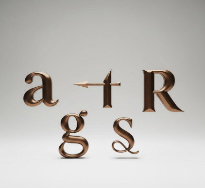
I used to think finials were just decorative flourishes—something typographers added when they had too much time on their hands.
Turns out, these tiny ornamental details sitting at the stroke terminals of letters like ‘a’, ‘c’, ‘f’, and ‘r’ do something way more sophisticated than I gave them credit for. They’re architectural endpoints that resolve visual tension, guide the reader’s eye through letterforms, and—here’s the thing—they completely change how we percieve a typeface’s personality. Renaissance printers in Venice around 1470 or so started experimenting with these terminal embellishments because their metal type needed optical adjustments to look balanced when inked and pressed onto rough paper. The finials weren’t just pretty; they were compensating for mechanical limitations, adding tiny hooks and balls and teardrops to prevent strokes from looking chopped off or unfinished.
Different finial shapes create wildly different moods. A ball terminal—think of the rounded blob finishing the ‘a’ in Didot—feels elegant, almost aristocratic. Teardrop finials, like the ones in Perpetua, carry this sort of calligraphic warmth that reminds you someone once held a pen. Then you’ve got beak terminals, those sharp, angled cuts in faces like Bodoni, which read as crisp and modern even though Bodoni’s from the 1790s.
Anyway, I’ve spent probably too many hours staring at the difference between a serif and a finial, and honestly, the distinction still trips people up.
The Mechanical Logic Behind Why Finials Actually Solve Real Problems
Finials exist because straight cuts look wrong.
When a stroke just ends—no taper, no ornament, nothing—your eye gets stuck there like hitting a wall. Type designers realized centuries ago that terminals need some kind of resolution, a visual full stop that doesn’t feel abrupt. So they added finials: swashes that curl back into the letter’s body, hooks that ease you off the stroke, or simple rounded caps that soften the exit. It’s not about decoration; it’s about managing visual momentum. In sans-serif faces, you don’t usually see finials because the whole point is blunt terminals—the strokes end and that’s that. But even there, designers sometimes sneak in subtle shaping, a barely-perceptible curve or chamfer, because completely flat cuts can feel lifeless or mechanical in ways that don’t quite work for extended reading.
How Historical Printing Technologies Accidentally Invented Finial Diversity We Still Use Today
Metal type punches demanded precision, but ink spread unpredictably. Early typographers carved finials partly to control how ink pooled at stroke endings—too much ink and a terminal blobbed out; too little and it looked anemic. By the 1500s, punchcutters in France and Italy were developing wildly varied finial vocabularies: some added tiny serifs to finials themselves (finials on finials, basically), others carved exaggerated teardrops that trapped ink just right.
Phototype and digital fonts changed everything, obviously. You don’t have ink spread anymore, but the finial shapes survived because—wait—maybe because they’d become ingrained in our reading expectations? A Garamond ‘a’ without its delicate ear finial doesn’t look like Garamond anymore; it looks broken. We’ve internalized these shapes as part of typographic identity, even though the original technical reasons evaporated decades ago.
The Subtle Emotional Signals Finials Broadcast That Most Readers Never Consciously Notice
Here’s where it gets weird.
Finials trigger micro-reactions you definately don’t think about while reading, but they’re there, shaping your impression of the text. A typeface with restrained, minimal finials—say, a simple taper—feels neutral, trustworthy, maybe a little corporate. Heavy ball terminals read as traditional or literary, the kind of thing you’d expect in a novel or a museum placard. Flamboyant swash finials, the kind that loop and curl extravagantly, scream luxury branding or wedding invitations; they’re too much for body text but perfect when you want maximum personality in three words. I guess it makes sense that designers obsess over these details—changing a finial from a beak to a ball can shift a font’s entire emotional register without altering a single other dimension.
Why Contemporary Type Designers Still Argue About Finial Proportions Like It’s the Renaissance
You’d think by now we’d have figured out the optimal finial shapes, but nope. Modern type design forums are full of designers debating whether a finial should extend 12% or 15% beyond the stroke width, whether the curve should be elliptical or circular, whether the ball should sit on-axis or slightly raised. It’s almost comically obsessive, but also kind of beautiful? These decisions matter at 10-point sizes in ways that are nearly invisible yet somehow crucial to reading comfort over hundreds of pages. Digital tools let designers test thousands of variations instantly, but the judgment calls remain deeply subjective, rooted in aesthetic traditions that stretch back five centuries and in individual designers’ personal philosophies about what letters should do and be.


