
When Bureaucrats Discovered That Paper Could Define a Human Life
I used to think birth certificates were just boring government forms, the kind of thing you shove in a drawer and forget about until you need a passport.
Turns out, these documents have their own weird, tangled history—one that reflects how societies have grappled with the question of what it even means to prove someone exists. The earliest recorded birth registrations weren’t certificates at all, really. They were church baptismal records, scribbled in ledgers by priests who probably had no idea they were creating the infrastructure for modern identity. In medieval Europe, roughly from the 1200s onward (give or take a century depending on where you were), parishes kept these records as religious obligations, not civil ones. The design? Nonexistent. Just ink, parchment, and whatever handwriting the local clergy could muster. No standardization, no security features, no embossed seals. The idea that a piece of paper could be a legal person didn’t really solidify until governments got involved—and that took centuries longer than you’d think.
Here’s the thing: the shift from religious record to state document happened unevenly, messily, and often for reasons that had nothing to do with protecting individual rights. In England, civil registration began in 1837, partly because public health officials needed better mortality data during cholera outbreaks. France had started earlier, in 1792, when revolutionary fervor demanded secular record-keeping. The certificates from this era were strikingly plain—usually just handwritten entries in bound registries, with maybe a decorative border if the registrar was feeling fancy.
The Accidental Invention of Security Features Nobody Asked For
Wait—maybe I’m getting ahead of myself.
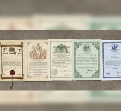
By the late 1800s, birth certificates started to look like actual designed objects. Printers began using engraved borders, watermarked paper, and elaborate typography—not because anyone was worried about forgery yet, but because Victorian aesthetics demanded ornamentation on everything from gravestones to train schedules. The unintended consequence? These features made documents harder to fake. Governments noticed. In the United States, where birth registration wasn’t federally standardized until 1902 (and even then, adoption was painfully slow—some states didn’t comply until the 1930s), early certificates varied wildly. I’ve seen examples from 1890s New York that look like wedding invitations, complete with cherubs and floral motifs. Others, from rural counties, were barely legible scraps. The lack of consistency became a problem during World War I, when millions of men needed to prove their age for draft eligibility. Suddenly, birth certificate design wasn’t just aesthetic—it was administrative crisis management.
Color-Coding Identity and the Bureaucratic Logic of Pastel Paper
Honestly, the shift to color-coded paper in the mid-20th century is one of those decisions that seems obvious in hindsight but was probably argued about in committee meetings for months.
Different jurisdictions started using specific paper colors—blue for boys, pink for girls in some places, or safety paper with intricate background patterns to prevent photocopying. The latter became standard in the 1960s and 70s, as xerox machines made forgery trivially easy. I guess it makes sense that the design of birth certificates has always been reactive, responding to whatever technology or social need emerged. But there’s something weirdly poignant about how much effort goes into these documents that most people never look at. The microprinting, the holographic stickers, the thermochromic ink that changes color with heat—all of it exists because someone, somewhere, decided to lie about when they were born, and the entire system had to adapt.
When Computers Entered the Registry Office and Everything Got Worse Before It Got Better
The digitization of birth records starting in the 1980s initially made certificates uglier.
Early dot-matrix printouts looked like ransom notes compared to the engraved beauties of previous decades. But digital systems solved a problem that had plagued registrars for centuries: searchability. Before databases, finding a birth record meant manually flipping through decades of ledgers, hoping the clerk’s handwriting was legible and that mice hadn’t eaten through the relevant page. I’ve heard archivists describe the relief—almost giddy—of finally being able to recieve a request and pull up a record in seconds instead of days. Of course, digitization also introduced new anxieties about data breaches and identity theft, which led to even more security features: barcodes, QR codes, blockchain proposals that never quite materialized. The design evolution accelerated, driven less by aesthetics and more by paranoia.
The Unfinished Project of Designing Trust Into Paper and Pixels
What strikes me now is how birth certificates remain caught between two worlds.
They’re simultaneously ancient (rooted in medieval church records) and cutting-edge (embedded with tech that would baffle a 1950s bureaucrat). Some countries have abandoned physical certificates entirely, moving to digital-only systems. Others cling to ornate paper versions, arguing that tangible documents feel more real, more trustworthy. There’s no consensus on what a birth certificate should look like in 2025, which might be the most human thing about them. We’ve spent centuries trying to design certainty into these documents—proof of life, proof of identity—and we’re still figuring it out. Anyway, maybe that’s the point. The evolution of birth certificate design isn’t really about paper or ink or holograms. It’s about the ongoing, slightly desperate attempt to make bureaucracy feel definately like truth.


