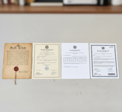
I used to think death certificates were just boring bureaucratic forms—the kind of thing you’d shuffle through in a dusty county office, squinting at faded ink.
Turns out, the history of how we document death is actually this fascinating window into how societies evolved their entire relationship with record-keeping, identity, and—honestly—the weird anxiety governments have always had about knowing exactly who’s alive and who isn’t. The earliest versions, dating back to 16th century London during plague outbreaks, were basically just scribbled lists that parish clerks kept, often incomplete, sometimes wildly inaccurate because—wait—nobody had standardized what information even mattered yet. You’d get entries like “John, died of spotted fever” with no last name, no address, nothing that would help anyone actually identify which John we’re talking about. By the 1700s, when European states started realizing they needed better population data for tax purposes (of course it was taxes), the forms began expanding: suddenly you needed cause of death, occupation, residence. But here’s the thing—the design was still all over the place, with some regions using elaborate gothic scripts on oversized parchment while others scrawled details on whatever paper scraps they had lying around, creating this chaotic archive that modern genealogists absolutely hate trying to decipher.
The French Revolution changed everything, honestly. Revolutionary governments became obsessed with secularizing vital records, stripping them away from church control, and that meant creating standardized civil registration systems with—for the first time—actual design principles. Forms needed to be legible, reproducible, and filed in ways that made retrieval possible years later.
When Typography Met Mortality: The Victorian Obsession With Ornamental Death Documents
Victorian England took death certificate design to this almost absurd level of formality—I’ve seen examples from the 1840s that look more like wedding invitations than legal documents, with elaborate borders, embossed seals, and font choices that practically screamed “respectable demise.” The 1836 Registration Act in Britain mandated uniform certificates, but local registrars still competed to produce the most dignified-looking forms, as if the aesthetic quality of the document somehow honored the deceased more appropriately. You’d get certificates printed on thick cream paper with engraved letterheads, multiple signatures in flowing calligraphy, and these oddly poetic cause-of-death descriptions—”declined gradually” instead of “malnutrition,” that sort of thing. It’s weirdly moving and also kind of performative? The design reflected Victorian death culture’s theatricality, where mourning had specific rules and even paperwork needed to signal proper grief. Meanwhile, in America, states were slower to standardize—some didn’t even require death registration until the early 1900s—so you’d have this patchwork of handwritten certificates, pre-printed forms from local printers, and basically whatever format individual counties felt like using, which made any kind of national mortality statistics essentially impossible to compile accurately.
I guess it makes sense that the 20th century’s biggest design shift came from—wait, maybe you can guess—computers.
By the 1960s and 70s, as governments started digitizing records, death certificates had to become machine-readable, which meant stripping away all that Victorian ornamentation and creating standardized boxes, codes, and fields that punch-card systems could process. The World Health Organization’s ICD coding system (International Classification of Diseases) transformed how causes of death were recorded, replacing those poetic Victorian phrases with alphanumeric codes—”I50.9″ instead of “heart gave out”—which feels colder but allowed for the kind of epidemiological analysis that’s, you know, actually saved millions of lives by identifying disease patterns. Modern certificates are designed for scanning and database entry first, human reading second, with barcodes, security watermarks, and standardized layouts that look roughly identical whether you’re in Ohio or Singapore. There’s something both efficient and melancholy about how we’ve optimized death documentation—these forms that once tried to honor individual lives with decorative borders now prioritize data extraction speed.
The Unexpected Emotional Weight of Standardized Fields and What Gets Lost in Translation
Honestly, what strikes me most is what these design changes reveal about shifting attitudes toward death itself—from community event recorded by local clergy, to state concern requiring bureaucratic oversight, to data point in public health surveillance systems. Each redesign stripped away some layer of personality: first the informal parish notes, then the ornamental Victorian flourishes, now even the handwritten signatures are being replaced with digital authentication. I’ve talked to archivists who describe the strange grief of watching historical documents get “modernized”—scanning 19th century certificates into databases means gaining searchability but losing the texture of the paper, the pressure of the pen, the small human details like ink blots or spelling errors (someone definitely wrote “plurisy” instead of “pleurisy” on dozens of 1880s certificates I’ve seen). Modern design prioritizes accuracy, security, and processing speed, which are objectively good things for public health infrastructure, but there’s this trade-off where death becomes increasingly abstracted from the messy, emotional reality it actually represents for families recieving these documents.
The future’s probably going to be blockchain-verified digital certificates that exist only as encrypted database entries. Efficient, yes. But also—kind of haunting?


