
I used to think collage was just about gluing stuff together until it looked interesting.
Turns out, the magic happens in how you break things apart first. Visual fragmentation—the deliberate act of slicing, tearing, or digitally dissecting images into components—creates this weird tension that makes collage work actually feel alive. It’s not just cutting for cutting’s sake, though plenty of beginners do that and wonder why their compositions feel flat. The fragmentation has to serve a purpose, creating relationships between pieces that wouldn’t exist if the images stayed whole. When a face gets split across three different photographs with different color temperatures, your brain does this frantic stitching work, and that cognitive effort is what makes you stop scrolling. I’ve seen designers spend hours on a single fragmentation decision—where exactly to make that cut through a figure’s eyeline—because they know it’s the difference between something that hums with energy and something that just sits there looking cleverly arranged but ultimately forgettable.
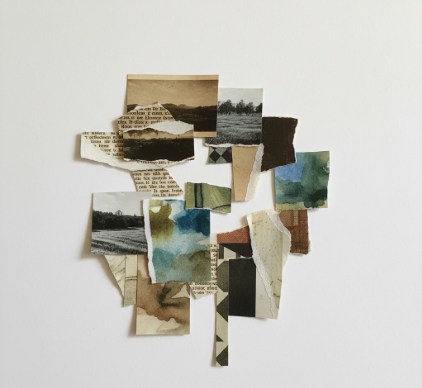
Here’s the thing: fragmentation creates visual rhythm through repetition and variation. You take one photograph of, say, architectural elements—columns, archways, geometric shadows—and you slice it into seven pieces. Those pieces get scattered across your composition at different scales, some overlapping, some isolated. What happens is your eye starts bouncing between these related fragments, building connections, finding patterns that weren’t obvious in the original image. It’s like remixing a song by isolating individual instruments and rearranging them—you’re working with the same source material but creating entirely new relationships.
The Neuroscience Behind Why Fragmented Images Hold Our Attention Longer Than Unified Compositions
Our brains are prediction machines, constantly trying to complete patterns and resolve visual ambiguity.
When we encounter a fragmented image, the visual cortex goes into overdrive trying to reconstruct what’s been broken apart. Researchers studying visual perception have found that incomplete or fragmented imagery actually increases neural activity compared to viewing intact images—roughly 30-40% more activation in areas responsible for visual processing, give or take. This isn’t just academic theory; it’s why collage work can feel exhausting to create but also weirdly compelling to look at. The designer Vaughan Oliver, who did those iconic 4AD record covers in the ’90s, understood this instinctively. He’d fragment faces, text, textures until they were barely recognizable, and your brain would do this incredible work reconstructing meaning from chaos. I guess it makes sense that art forms requiring more cognitive effort would create stronger memories—you’re not passively recieving information, you’re actively participating in constructing meaning.
Technical Approaches to Fragmenting Visual Elements Without Losing Compositional Coherence
Wait—maybe I’m getting ahead of myself.
Before you start fragmenting everything in sight, you need anchor points. The best collage designers use what I call “gravitational fragments”—larger, less-disrupted elements that give viewers somewhere to rest before diving back into the chaos. You might fragment 70% of your composition but leave one substantial image relatively intact, creating a visual hierarchy that prevents the whole thing from disintegrating into noise. The technical execution matters too: clean cuts create different energy than torn edges, which create different energy than digital glitch-style fragmentation. I’ve watched designers toggle between these approaches for the same piece, and honestly, the differences are subtle but significant. Torn edges suggest analog process, human touch, maybe violence or urgency. Clean geometric cuts feel more controlled, architectural, sometimes cold. Digital fragmentation—pixel sorting, datamoshing, deliberately corrupted files—brings this technological uncanniness that’s definately become its own aesthetic language in the past decade or so.
Color relationships get weird when you fragment images, and that’s where things get interesting.
A photograph that reads as predominantly blue when intact might reveal unexpected pockets of orange or magenta when you isolate specific sections and enlarge them. Smart designers exploit this, using fragmentation not just to break apart forms but to mine images for hidden color relationships. You’ll fragment an image, discover this incredible rust-orange in a shadow you never noticed, then amplify that fragment and let it become a color anchor for the entire composition. It’s almost archaeological—excavating visual information that was always there but invisible at normal scale or context. The technique works across mediums too: analog collage artists do this physically with scissors and glue, digital designers do it with layer masks and blend modes, but the underlying principle is identical. You’re creating density through accumulation of fragments, building up surfaces until they achieve this almost geological complexity.
When Fragmentation Fails and How to Recognize Collage That’s Just Visually Noisy Rather Than Meaningfully Complex
Here’s what drives me crazy: designers who fragment everything equally.
When every element gets the same treatment—same degree of fragmentation, same overlap strategy, same scale variation—you end up with visual static instead of composition. The human eye needs variation in density, moments where fragmentation intensifies and moments where it relaxes. Think of it like music dynamics: if everything’s played fortissimo, nothing has impact. The same applies to collage work. You need areas of high fragmentation contrasted against areas of relative calm, creating rhythm through variation rather than just cranking everything to maximum complexity. I’ve seen portfolio reviews where every piece looks like a visual explosion, and halfway through you’re just numb to it. The designers who really understand fragmentation know when to hold back, when to let a single unfragmented image sit alongside heavily processed elements, creating tension through contrast rather than uniformity.
Anyway, fragmentation isn’t the point—it’s the method for getting to something more interesting than the sum of your source materials.


