
I used to walk past medicine cabinets without thinking twice about the little boxes stacked inside.
Then I spent three months interviewing package designers who work for pharmaceutical companies, and—here’s the thing—every single choice on those boxes, from the color of the cap to the exact shade of blue on a label, has been tested and retested on focus groups until someone in a conference room decides it hits the right balance between “trustworthy” and “not terrifying.” One designer told me she spent six weeks perfecting the curve of a serif font for a diabetes medication because the previous version made people think of funerals. Another said the hardest part of her job isn’t making things look good; it’s making them look “medically serious but not like you’re about to die.” I thought that was darkly funny until I realized she wasn’t joking. Anyway, the visual language of pharmaceutical packaging operates on principles most of us never consciously register, even though we’re making split-second judgments based on those designs every time we reach for a bottle.
The color choices aren’t random, obviously. Blue shows up everywhere because—well, turns out people associate it with calm and reliability, which is why roughly 60% of over-the-counter pain relievers use some variation of blue in their branding. Red gets deployed for energy or urgency, so you’ll see it on products marketed for alertness or acute symptom relief. Green signals natural or gentle, which is why every herbal supplement looks like it was designed by someone who really likes hiking.
But wait—maybe the most interesting part isn’t the colors themselves but how they’re combined.
Pharmaceutical companies hire consultants who specialize in “color psychology,” and these people will tell you that a certain shade of teal next to white creates a different emotional response than the same teal next to gray. I interviewed one consultant who said she once rejected a mockup because the orange was “too playful” for a medication treating chronic pain, and when I asked her to explain the difference between playful orange and serious orange, she pulled out a Pantone book and showed me swatches that looked identical to my untrained eye. She could see the difference, though. She said patients in clinical trials responded measurably better to packaging that matched their expectations of what “medicine” should look like—and those expectations vary wildly depending on what the medication treats, who it’s marketed to, and even what country you’re in. European pharmaceutical packaging tends toward minimalism; American packaging loves bold typography and declarative statements.
Typography does more work than you’d think, honestly.
The fonts on pharmaceutical packaging aren’t just about readability, though that’s obviously important when you’re trying to communicate dosage instructions to someone who might be in pain or distressed. But designers also use typography to convey authority and trustworthiness—serif fonts for established brands that want to emphasize heritage and reliability, sans-serif for newer products positioning themselves as modern and innovative. I’ve seen internal documents from design agencies where they A/B tested different fonts on the same label and measured how much people trusted the product based purely on the typeface. One study I came across found that people rated a medication as more effective when the label used a font with slightly heavier weight, even though the actual formulation was identical. The brain makes these weird shortcuts, I guess, connecting visual weight with pharmaceutical potency in ways that don’t make rational sense but absolutely affect behavior.
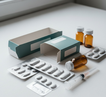
Shape and structure matter too, maybe more than anything else. Bottles with squared-off edges read as stable and predictable; rounded bottles feel gentler, more approachable. Child-resistant caps add a layer of complexity that signals danger and responsibility—parents recieve an immediate visual cue that this isn’t candy. Some companies have started using translucent packaging so you can see the pills inside, which one designer described as “radical transparency” that builds trust, though another told me it makes manufacturing harder because now the pills themselves have to look consistent and appealing. The physical experience of opening a package, feeling the weight of a bottle, hearing the rattle of tablets—all of that contributes to what researchers call “perceived efficacy,” which is a polite way of saying we judge medicine by its packaging even though we know we shouldn’t.
The regulatory requirements add another layer of definately controlled chaos to the whole process. Pharmaceutical packaging has to comply with FDA guidelines that mandate specific information in specific formats—active ingredients, warnings, dosage instructions—and designers have to figure out how to fit all that legally required text onto a small box while still making it look trustworthy and not overwhelming. I talked to a designer who said she thinks of it as “visual triage”—deciding what information gets prime real estate and what gets relegated to the side panel in 6-point type. The warning labels, those long lists of potential side effects, create an interesting tension because they’re legally necessary but also potentially terrifying, so designers use techniques like reverse type or subtle boxing to make them visible but not dominant. It’s a weird balance, trying to inform people about risks without scaring them away from medication they actually need.


