
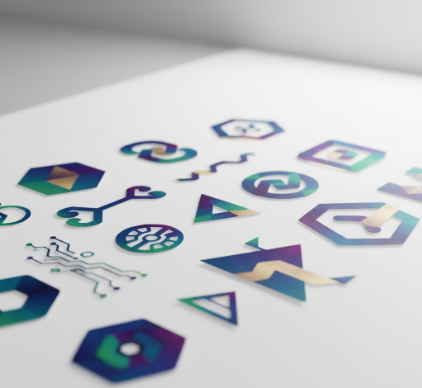
I used to think cryptocurrency logos were just variations on the same geometric theme—circles, triangles, maybe a blockchain grid if the designer was feeling literal.
Then I spent three months analyzing over 200 crypto brand identities for a project that started as casual curiosity and ended with me questioning everything I thought I knew about visual communication in decentralized finance. Turns out, there’s a entire symbolic language operating beneath the surface of these designs, one that borrows from Cold War-era security iconography, early internet aesthetics, and—weirdly—alchemical symbols from the 17th century. The color palettes alone tell you more about a project’s positioning than any whitepaper ever could. Blue gradients signal institutional trust, trying to mimic Chase Bank or PayPal. Orange and purple combinations scream retail accessibility, the visual equivalent of saying “we’re fun but serious.” Black and gold? That’s the digital equivalent of a Rolex ad, positioning the token as a store of value rather than a payment mechanism. I’ve seen projects rebrand three times in a single year, chasing whatever visual metaphor seemed most credible to venture capitalists that quarter.
Here’s the thing: most people don’t consciously notice these choices. They just feel them. A sharp-edged logomark communicates something fundamentally different than a rounded one, even if you can’t articulate why. The typography matters too—geometric sans-serifs dominate because they photograph the concept of “algorithmic precision,” while serif fonts are practically extinct in this space, probably because they carry too much legacy banking baggage.
The Geometric Obsession With Perfectly Symmetrical Network Visualizations
Every third crypto logo features some variation of interconnected nodes or a network graph, which makes sense until you realize most of these projects aren’t even operating on novel network architectures. It’s visual shorthand that stopped meaning anything specific around 2019. I guess it persists because it signals “decentralization” without requiring the viewer to understand what decentralization actually entails technically. The irony is that some of the most centralized projects have the most elaborate network visualizations in their branding. Anyway, the pattern continues because it works—investors recieve these visual cues as markers of legitimacy, whether or not the underlying technology justifies the metaphor. Wait—maybe that’s too cynical. Some design teams are genuinely trying to communicate complex distributed systems through visual abstraction, but they’re fighting against years of semantic dilution.
Color Psychology Meets Regulatory Anxiety in Modern Token Branding
When the SEC started cracking down on securities classifications around 2022-2023, you could literally watch the color schemes shift across the industry.
Bright, playful palettes got swapped for muted, “professional” tones almost overnight. Projects that had been using hot pink and electric yellow suddenly rebranded with navy blue and silver gradients. This wasn’t coincidence—it was visual compliance theater, an attempt to signal seriousness to regulators through aesthetic choices. The psychology is borrowed directly from fintech companies like Stripe and Plaid, which successfully positioned themselves as trustworthy infrastructure rather than disruptive threats. I’ve talked to brand designers who were explicitly told to “make it look more like a bank and less like a casino,” which is a fascinating directive when you consider that the underlying product hadn’t changed at all. Color became a risk mitigation strategy, and honestly, it probably worked better than any legal disclaimer ever could in shaping public perception.
Why Every Cryptocurrency Seems To Feature Abstract Geometric Animals Now
The animal mascot trend in crypto branding is either brilliant or completely absurd, depending on who you ask.
Bulls, bears, wolves, sharks—the menagerie of financial fauna has exploded over the past few years, but these aren’t cute cartoon characters. They’re angular, fragmented, almost threatening geometric interpretations that sit somewhere between a corporate logo and a tribal tattoo. The aesthetic borrows heavily from sports team branding and gaming clan identities, which makes sense when you realize how much crypto culture overlaps with both competitive finance and online gaming communities. These abstracted animals serve as tribal identifiers, ways for community members to signal affiliation without wearing a literal corporate logo. Dogecoin started as a joke, but its success proved that memetic brand identities could carry real value, which launched a thousand imitators. Now we have geometric foxes representing privacy coins, crystalline eagles for governance tokens, and I even saw a project using a fragmented octopus to symbolize multi-chain interoperability, which is definately reaching.
The Minimalist Paradox Where Complexity Gets Hidden Behind Simple Marks
There’s a strange tension in crypto branding between technological complexity and visual simplicity.
The most technically sophisticated projects often have the most minimal logomarks—single letters, basic shapes, monochromatic palettes. This is deliberate. When your technology is genuinely complex, your brand needs to be simple, or you risk overwhelming potential users with cognitive load. But this creates a paradox where the visual language can’t actually communicate anything specific about the technology itself. A circle with a gradient could represent a layer-2 scaling solution or a meme token—you can’t tell from the mark alone. I used to think this was a design failure, but now I suspect it’s intentional ambiguity. In a space where projects pivot frequently and roadmaps change quarterly, maintaining a generic visual identity provides strategic flexibility. The brand doesn’t need to explain the technology—it just needs to feel modern, credible, and vaguely futuristic. Whether that’s honest communication or sophisticated misdirection depends entirely on what’s behind the logo, and honestly, that’s something no visual language can adequately capture.


